We are a culture that expects the expected. We like stability and consistency because we see it as our security blanket. Consistency and stability lets us know what we need to know, it keeps our fears at bay because we know what to expect, it keeps us sane because we know that though the sun might set tonight, it will be back tomorrow. However, there is a saying that change is good, and we like to believe that we believe it, so we say that change is good and that it’s something ‘new.’ Automatically, in our head, we assume that ‘new’ is good. However, change is only ever good when YOU like the changes made.
| Picture taken from The Huffington Post |
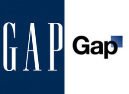
Gap was once a single clothing store founded by a married couple in San Francisco, and now Gap is a company worth thousands of millions of dollars with clothing stores stretching across the globe from the United States to France, Germany, Japan, and so on. Having also acquired fans of its own, the Gap brand is widely known, and also known to associate with other store brands such as Old Navy and Banana Republic. After having been in business for over 40 years, Gap has recently decided to forgo a logo change from a blue box containing the name of the brand, to a white canvas with the brand lettering in the center and a small blue box in the upper right hand corner intercepting the top right of the letter 'p'. After the new logo was made public, net denizens went wild with questions, remarks, and complaints because the logo they had once identified with, the classic image that identified their brand, had changed. The revamping of the company logo proved to be a failure, because after a week of their new logo release, Gap reverted back to their original logo.
No comments:
Post a Comment