WELCOME

.WELCOME TO MY DIMENSION.

Monday, November 29, 2010

Utopian Design In Society

Image taken from sbrunthiscity.blogspot.com


A Utopian design that has recently been popularized in society, though it has probably existed alongside humanity for longer than a few decades now, is the canteen. Because of recent global issues pertaining to waste and global warming, ‘going green’ has become a popular theme in the recent years; and from this need to ‘go green’ the redevelopment and redesign of the canteen has been a solution set forth to appeal to the population to hinder the consumption of bottled water.

Every year, 28.9 billion plastic water bottles are purchased by Americans, and every hour 2.5 million bottles are thrown away. The production of plastic can account for 4% of energy consumption in the United States. Plastic production also requires consumption of approximately 1.5 million barrels of petroleum on a yearly basis, which is enough to power 100,000 cars for a year. However, the resources used to create these plastic bottles are wasted and cannot be reused because only one percent of the 28.9 billion plastic bottles will ever be recycled. Though one recycled bottle can light a 60-watt light bulb for approximately six hours, and reduce greenhouse gas emission, it is estimated that 80% - 90% of the bottles will still wind up in a landfill, whose closing rate is, at the moment, estimated to be one per day.

The canteen, whose functions are identical to that of a water bottle, is a design driven to improve society and possible your finances and health, because the price of bottle water, compared to tap water, can cost up to 10,000 times more per gallon, and bottle water sold across state line is not regulated and their sources are tested only once every one to three years. 

Color Transforms

We exist in a society in which color symbolism has been predetermined. Groomed to discriminate and subjugate colors to embody certain concepts that will influence the design of different entities, colors can transform a singular design to mirror its symbolism. From birth, the judgment of color and their symbolism and meanings is ingrained in us. Momentary leaving the womb of our mothers, boys are wrapped and surrounded by what we deem to be masculine colors, and girls by what society has agreed upon to be feminine colors. A father would hardly allow their sons to be absorbed in pink, but expect their daughters to be because pink is a ‘girl’ color.

Collette Dinnigan Fall 2010 Collection
The fashion industry is a major entity in which color symbolism is used to enhance the design concept, because color transforms the design. Looking at clothing, any red garment, regardless of design, can be linked to being sexy, as black can be linked to sophistication, and earthly tones can be linked to radiate a bohemian quality.

Collette Dinnigan SP 2011 Collection
Seasons are another way in which color transforms design in the fashion industry. According to what some consider common knowledge, certain colors are designated for certain seasons. Bright colors are designated to appear and be worn in spring and summer seasons, whilst matte and dark colors are allocated to appear in fall and winter seasons. Observing society, a pattern of brightly colored garments is only seen to be sold during spring and summer, and garments of the same variety in darker colors are only sold during fall and winter. In this way, color can transform a single design to symbolize certain concepts, and use.

Dangerous Design

America is a nation that continues to battle with ‘obesity’. We strive to become and remain thin and slender; because that is what society markets to us as beauty; because that is what we have to achieve to fit (literally and figuratively) into society. Though society is gearing to change its symbol of beauty by promoting plus size figures, with companies and products like Curves, Jenny Craig, Slim Fast, and many more, dieting is still a large American cultural trend. However, recently a new regime to aid in weight reduction has emerged and can be considered a dangerous design. The ‘Tapeworm Diet,” is the new method, design to get-thin. Claiming to be an all-natural diet, the tapeworm diet constitutes that the dieter ingest undercooked meat of an animal (most often a cow or something within the same family) that has been laced with the parasite. The parasites will then grow into a tapeworm that will then attach itself to the intestinal track of the consumer and absorb the nutrients from the food that the consumer would later ingest.


Fairly new, the design of the Tapeworm Diet has grown somewhat popular among women who claim to have seen the failings of other dieting methods and designs first hand. Though some people have seen positive results after trialing the diet, the risk factors involved in the use of this method is what makes Tapeworm Dieting a dangerous design. Unintentional, some of the risks of ingesting the tapeworm bacteria consist of abdominal pain, nausea, spontaneous emergence of proglottids (tapeworm /flatworm) from the anal sphincter, mild eosinophilia (parasitic infection), and more.

Though this has been made and marketed into a good business due to the American desire to be thin, this new method of dieting is of dangerous design, because it exposes the user to health risks that may render the ending of a life.

LINKS: diets in review tapeworm diet

Thursday, November 11, 2010

Cotton: No Longer The Fabric Of Our Lives


In these past recent years the media has been urging the population to go green, buy a Prius, support natural entities, and swap to cotton made products; due to challenging scares like global warming. However, now that the general public has taken notice of this need to swap their polyester (a man-made fiber that is resistant to crease, shrinkage, stretching, and can be blended with other fibers to create different texture and surfaces) and other synthetic fibers for cotton, cotton will no longer be eagerly available, and of the cotton that is available, it would cost more than when it was advertised by the media, urging for its consumption.

Due to recent disasters, most likely a result of global warming, floods and bad climate in general has left the market in a cotton shortage; as reported by the New York Times. Thusly, stores, brands, and industry companies are looking to supplement a certain amount of cotton with polyester fibers – or other man-made fibers – to create a cotton blended fiber/textile, as well as to increase the prices of their cotton products. Wesley R. Card, president and chief executive of the Jones Group, who backs brands such as Nine West and Anne Klein, has agreed that cotton clothing (and possibly other products that involves the use of cotton, because the cotton crisis effects other industries besides the clothing industry) will become more costly.  Levi’s, a  brand and company known for their denim, who consumes a large amount of cotton in its production process of jeans, has already reported a price increase and is considering another price increase on their cotton products. All in all, the production industries will, in the near future, be consuming more man-made fibers, rather than natural fibers. So be prepared to wear polyester.

Ergonomic Design: FAILED

The Gospel 1455. Walters Art Museum, Baltimore
There have been controversies over the internet in regards to when and where the first high heeled shoes originated. Elizabeth Semmelhack, a curator for the Bata Shoe Museum, theorizes that the first high heeled shoe may have originated in the Middle East before the 10th century. Her theory is based upon paintings and pictures of horseback riders in shoes with upside down ‘V’ like arch designs. Also present were European illustrations of Middle Eastern men at the same time donning the heeled shoe. According to Semmelhack, the purpose of the shoe was to aid the rider, for the heel created less chances of slippage on the stirrup. However, some has argued that heels originated in the 15th century from chopines – shoe overlays/covers that were highly heeled and worn by women to protect their garments and shoes from getting dirty – which led to the revolutionary heels worn by King Louis XIV of France and its further development into the shoes we today associate with.

Nonetheless, though the high heeled shoes back then were worn and used for functional purposes; and though they may have been confortable, high heel shoes in this time and age are objects and products with one purpose in mind: aesthetics. Heels can be considered a failure in ergonomic design because it fails to meet all (except one) of five areas of ergonomic design requirements: safety, comfort, ease to use, performance, and aesthetics.
DKNY from DKNY.com
According to Maria Cerruto, personnel in the department of biomedical and surgical services at the University of Verona, Italy, heels can affect pelvic floor muscle activity by “reducing myofascial pelvic pain, relaxing the pelvic floor and improving pelvic organ well-being!” However, though heels do offer this positive quality about themselves, their bad traits outweighs their good. As a safety concern (health-wise), heels can cause feet deformations (such as bunions), unsteady gaits (the manners in which a person walks / moves), blisters and corns, and many other medical related problems. Though some women claim that some heels can be comfortable, it is only most likely so due to the possibility that the heels they wore before they found the “comfortable heel” were so uncomfortable that the new comfortable heel, though still uncomfortable, provided less discomfort and was thus label comfortable compared to the old heels. Heels provide the least amount of comfort in the realm of all shoes, because it required one to stand as though on their tippy-toes,  forcing the feet to arch. Another discomfort in heels is the tips of the shoes which enforces all five toes into a tightly packed area, causing the toes to cramp and may even result in blisters at the sides and top of toes.

Givenchy from Shopperwoman.com

Ease wise, heels are difficult tools to maneuver. It may be easy to put on, but to use it as though one would a regular pair of shoes (like flats or tennis shoes) is impossible. High heels enforces the wearer to take shorter strides and apply balance to each step (especially when on cracked, asymmetrical, or raised platforms) because a slip can results in sprains and fractures. Since high heels also provide very little performance/ productivity, it adds to its failure as an ergonomic design. For in the performance department, heels will not allow for running, jumping, or any exercise related movement (other than walking and standing still).


Chanel from Mycolorfashion.com
However, the one attribute that heels have in their designs that relate to ergonomics is aesthetics. Supported by fashion power houses like Chanel, Dior, DKNY, Christian Louboutin,Versace, and Givenchy – who all have their own lines of high heeled shoes – heels have become strong components in what we consider an beauty accessory. Constructed in arrays of colors, shapes, designs, and materials to appeal to the female race, it’s hard not to indulge. Though we know the consequences of donning them, we are found willing to forsake it for “beauty.” Giving the illusion of smaller feet (according to Chinese history, they once bounded the feet of their daughters to prevent growth, for small feet were considered a sign of beauty), a taller figure with longer limbs (another sign of beauty linked to the requirements of being a model and the clothing standards in society), and better defined legs and rear, we ignore the negatives. Most of the female race can look past it the pain for the price of “beauty”. As the saying goes, ‘Pretty Hurts.”

Louboutin from NYdailynews.com
LINKS: Walters Art Museum Origin: Discussion Sex, Power, & Heels Bata Shoe Museum Suffering for Beauty Video: Health Christian Louboutin Givenchy DKNY Maria Cerruto Shoe Terms Chanel Versace

Monday, November 8, 2010

Ad Controversy: Word and Image

Thinking about how words and images work together in design, I stumbled upon this song by Fabulous, featuring Ne-Yo. The song is called ‘You Make Me Better’ and it’s chorus goes like a little something like this…
I'm a movement by myself
But I'm a force when we're together
Mami I'm good all by myself
But baby you, you make me better
You make me better
 ‘You Make Me Better”, raises the concept that two is better than one, insinuating that though one would not crumble if left alone, one would become greater if complimented and accompanied by another. The concept found in this chorus is, in my opinion, the best way to describe how words and images work together in design.

The function of word and image in design are laid out in these lyrics. Throughout all works in the design industry, images and words have stood alone and together. However, when alone, they are only a movement- a measure, an effort, a will- trying to evoke an emotion, an action, an idea. When they come to work together, however, they become a force - dynamism, an energy, a strength, a power- something better. They become an entity that propels you (the audience/viewers/spectators), pushing forward, telling and communicating exactly what they are, what is happening, what they stand for, and what they want – by drawing two similar ideas that complement each other or two opposing ideas that would contradict and spell out the sarcasm that would pointed toward the focal point.

Photo taken from The Fash Pack
An example would be the recent controversy over the latest Calvin Klein Jeans ad. The ad, posted on a billboard in SoHo New York was a shot of Lara Stone (with her shirt scrunched up to her bust, and no visible clothing below the waist, as it seems) with her head on the lap of one male, her body straddled by another, as another male model sits wearing an open shirt with one buttoning. The ad, shot within what seems to be a neighborhood setting (due to the backdrop of the fence and the graffiti displayed below on the cement), had the words ‘Calvin Klein Jeans’ printed at the bottom of the billboard. The image sent many vying for its takedown, claiming that it ‘suggested gang rape’ and violence.

Though the image had a strong pull, the ad would have proved a failure were it not for the wording at the corner of the billboard, because without the words, the ad (whose purpose was to advertise Calvin Klein jeans), would have confused the general public. Additionally, if the words ‘Calvin Klein Jeans’ was stamped across the billboard without the racy photograph, the billboard would have been a forgotten backdrop, never drawing attention to itself, proving to be a failed advertisement. 

The Army Designs


Though women has served the armed forces throughout history as auxiliary and health aid personnel, it was not until 1948 that they gained permanent resident in the armed forces.  Serving a role that had only, at one time, been meant for men, the population of women in the armed forces (which is 15% of the army’s 560,000 soldiers) has greatly increased; and thusly so has caught the attention of high officials (such as Brig. Gen. Peter Fuller, Program Executive Office Soldier). Understanding that women now play a large role in the forces, the army is setting a new design for army gear directed at women. 
New women's unifrom.

Only in the planning and testing stage, women are set to have their own uniform design that will be set to appear sometime in 2011.  Since men tend to have broader shoulders and a narrow waistline, it is difficult and uncomfortable for women to become physically active in such ill-fitting clothes (because though the army uniform can be considered ‘unisex’ it was still modeled for a man’s figure).  The new concept for women’s army uniform coloring and style will remain the same (camouflage patterned jackets and trousers), however, the design of the clothing will be tailored more to accommodate the female figure. The new design of women’s jackets will consists of 13 sizes with varying chest and waist measurements. The jacket and sleeve lengths will also be adjusted.  The new trousers will come in 13 different sizes with varying hip measurements and a lengthened ‘back rise’ to accommodate posteriors.  The new design will also cause many details of the army uniform to be repositioned – such as pockets and the army insignia. Setting out such a task, the army is integrating the female race more into permanence within the field of the armed forces.

Comics: Words and Images in Design

The concept of comics and their characters are perfected through the combination use of images and words.

One of my favorite comics of all time is a series known by every otaku. Naruto.

Naruto is a Japanese comic, a.k.a. manga, written and illustrated by Masashi Kishimoto. Jam packed with adventure and action, it hit the market in 1999 and was later in 2002 made into an anime due to its high popularity. The manga was later adopted into the U.S market; and in 2005, the anime version of the manga was aired.

The manga tells the story of Naruto Uzumaki, a ninja orphaned at birth and shunned by his village due to the kyuubi, a nine-tailed fox demon that had attacked the village, sealed within him. Through his use of words and images, Kishimoto tells the travels of Naruto and the travesties that he overcomes to become Hokage, the leader and strongest ninja in the village, who is recognized by all.

In Naruto, one of Kishimoto’s uses of words and images was reflected in his design of characters; which involved a five step process:  concept and rough sketch, drafting, inking, shading, and coloring. Sasuke Uchiha, Kishimoto’s favorite character, and the one he finds most difficult to illustrate, is the best friend of Naruto. However, unlike Naruto who is known as a loud-mouth, Sasuke is reserved, quiet, a genius, at ease, and mature. Kishimoto conveys Sasuke’s character by providing him with short dialogues and one answer responses; he also portrays him with dark empty eyes, long dark hair, and smug expressions. Thus, by combining the wording and images that Kishimoto accommodates to Sasuke, one can easily convey the type of personality that Sasuke holds.  In Naruto, Kishimoto uses character design and dialogue to relate certain readers to certain characters.
 
Naruto. From left to right: Sakura, Naruto, Sasuke. Image taken from narutoisland.fourmotion.com

Monday, November 1, 2010

Form and Content : Objectified


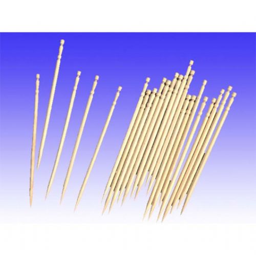
Objectified is a film that seeks to link everyday products to their designers. For designers, the form and content of products come together to tell a story because “every object has a story, if you know how to read it” (Henry Ford). Designers create indentations on handles of branch cutter are generated to provide grip, and redesign the blunt, serrated ends of toothpicks to provide a rest for the picks and indicate that it has been used. Designers design for an audience and functionality, always questioning and innovating. Objectified explains the reasoning behind designer innovations and inventions.

Photo taken from Alibaba.com
The film insinuates that, unlike designers, consumers are creatures of consumption and assumption who only seeks form. Consumers are always in want of the latest models and always making assumptions of an object at first sight; how it should feel; how it should work; what it should be able to do; how heavy it is, and how much it should cost. In a way, the film demonstrates that consumers,  only seek the form of a product; taking in its color, architecture, shape, and texture, and if they should find it aesthetically pleasing, purchase it only to throw it out when the newer models comes along, generating waste. It would not have occurred to the American consumer that the serrated toothpick ends were meant be broken and used to signal its usage or to pose it as a rest for the pick. In a world of consumerism, very second, millions of what can only be categorized as “stuff” is manufactured, designed, invented, innovated, discarded, and dumped into dumpsters. Consumers go through “stuff” as fast as they are created. Whatever is designed today may well be made of cardboard as commented by designer Karim Rashid, because it will be found in the trash bins somewhere in the world tomorrow.

Objectified demonstrates that to consumers, what you see is what you get because they don’t look for the story of a product, and to designers, there is more to a product than meets the eye because they connect to the product to provide a story. In addition, Gary Hustwit uses designer explanations, the work field, and designer perspectives in Objectified to show that there is a reason for every product, and a product for every reason.

Mass Production: Laptops


Laptops are mobile computers that first appeared in the 70s and 80s. Scarcely owned by the general public at the time of its first appearance, laptops were expensive, thick, and heavy with limited functions (compared to today’s understanding of laptop functions). Controversy over the first laptop created is subjected and depends widely one what one would require a machinery to operate and perform to be considered a laptop.

Image taken from Bindapple.com
However, today laptops are an industrial mass production product with a variety of brands and manufacturers.  Just like the many other industrial mass production products with its own variety of manufacturer and brands, laptops of all colors, processors, names and brands will end up in the same place, the dumpster.  With brands like Sony, Apple, HP, Alienware, Toshiba, etc… choosing a laptop is hard work because it will be our means of communication, knowledge acquisition (for homework and research), relaxation, and just about anything.  The laptop has even evolved (or de-revolutionized) itself into what is known as the net-book – a device similar to the laptop in looks and functions, but contain less memory space and is even more portable because of its sheer size. Designed with the consumer in mind and designed to appeal to consumers, laptops comes in different specs, weight, programming, looks and colors, and size.  
Image taken from Izideal.co.uk

Laptops, like many other mass produced products are a commodity chosen for their form. When we see the new Apple MacBook Air we don’t question why it is designed the way it is. Instead we state why we desire it; because it’s thinner, lighter, looks cooler, and lastly, because it’s “new”. When Sony remolded their laptop key boards to also contain a numerical key pad, we don’t question why they added it (even though numerical keys were already provided on the average keyboard). As consumers, we don’t question like we would as designers, we complain.

The looks and functions of laptops, with no relations to branding and styling, is common knowledge to the consumer. However, the design content of their looks and functions will only testify to their designers and eventually result in the same ending.   

Halloween Costume Design Transformation


Photo taken from HalloweenCostumes.com
Halloween is a holiday celebrated in the United States and parts of Europe on the 31st of every October. In the past centuries, Halloween was a day marked by the Celtics for the ending of the harvest season. It marked when the world of the living and dead would intersect, leaving way for the dead to cross over to the world of the living to wreak havoc among their crops and health.  Thusly, on the day of Halloween, the Celts would create attires such as masks and costumes to frighten and ward off the dead. However, in the later 19th century, the day earmarked for warding off the dead had reinvented itself into a form of children’s holiday.
In this century, the concept of Halloween has greatly changed as it has become a holiday celebrated by people of all ages and cultures in the United States. Today, Halloween entails dressing up, going from door to door and asking for a treat. Though the celebration of Halloween has not vanished over the years, costumes have suffered a great transformation. Costume design no long embodies an imagery of scariness, wonderland fantasy, and idol-ism, but an image referable to a noun and to attract the opposite sex.
Though anything in society today, from a plug on the wall to soda cans, is a design, and is design, Halloween costume design today has interestingly shifted from what was once a garment designed to ward off evil during a religious ritual into an altered garment designed to showcase bodily parts and hold sexual connotations. 

Monday, October 18, 2010

Fashion and Economy Highs and Lows


Economics is a science that deals with the production and consumption of goods and services. Fashion refers to the styles and designs of clothing. One deals with finance, analysis, structure, and graphs while the other deals with fantasy, emotions, and imagination. However, regardless of their meanings, it is stimulating to witness two subjects some would consider polar opposites to have the ability to predict and detail so much of the other; so as to have led to the development of a correlation. 

1910s - Photofrom Harper's Bazaar Magazine
1920s - Photo
1940s Photo from a lady's magazine
Discovered by a professor at the University of Pennsylvania, the Hemline Index is the common ground where economics and fashion correlates and where fashion becomes more than just clothes. The He
The Beat Girls - 1960s dance troupe
mline Index theorizes that during times of economic flourish, the fashions of women’s skirt lengths rises, and in opposition, during economic hardships their skirt lengths would render lower into more conservative lengths – so as to achieve a sense of security. However amusing some might find that fashion can predict the outcomes of the economy and vice versa, it is quite possible that the elevations and declines of women’s skirt lengths can correlate with the highs and lows of our economy. Looking back, in the 1920s when stock prices were high and the economy was flourishing, skirt lengths rose as high as to the knee. However, in the 1930s when the economy submerged into depression, the lengths of women’s skirts fell to mid-calf. Again, after the recovery from WWII, skirts elevated to an all-time high in the 60s, leading to the design of the mini skirt. It was not until the 1980s when the stock market crashed that skirt lengths fell again. However, after recovering from the crash, which lasted from the late 80s to early 90s, miniskirts became, once more, the pop trend (though dresses of different lengths were available). Then, during the 2000s, the economy fluctuated and drowned due to the events of September 11, the housing market, and the ‘war on terrorism’. It was during the fall of the housing market and the war (set around 2008) that maxi dresses (with the bohemian trend) became the new craze. 
Photo taken from Oscar de la Renta SP 2011

Bohemian Look
Trying to recover from this depression / recession that we are currently in, it is notable that our economy is beginning to steady and we’re on the right track; seeing as the length of skirts has risen to the calves and knees as recently seen in collections from designers such as Marc Jacobs, Max Azria, Nicole Miller, Nina Ricci, and Oscar de la Renta.